01
01
01
IMAX
IMAX
IMAX


Client
Client
D&AD/IMAX
D&AD/IMAX
tagline
tagline
Bigger & Bolder
Bigger & Bolder
Year
Year
2024
2024
About
About
This D&AD New Blood competition brief challenged me to design a bold new identity for IMAX that reflects its ever-growing experiences and strong connection with audiences worldwide. Research revealed that IMAX and its fans share a passion for big thinking and bold moves in all aspects of their lives, which became the foundation of the creative concept: "Bigger & Bolder." Taking inspiration from the brands successful 2018 campaign this idea drives a dynamic and adaptable design system that captures the emotions each IMAX experience ignites. Just when it seems IMAX can’t get any bigger, they break new ground again, unlocking even more thrilling possibilities with their 4 new offerings.
This D&AD New Blood competition brief challenged me to design a bold new identity for IMAX that reflects its ever-growing experiences and strong connection with audiences worldwide. Research revealed that IMAX and its fans share a passion for big thinking and bold moves in all aspects of their lives, which became the foundation of the creative concept: "Bigger & Bolder." Taking inspiration from the brands successful 2018 campaign this idea drives a dynamic and adaptable design system that captures the emotions each IMAX experience ignites. Just when it seems IMAX can’t get any bigger, they break new ground again, unlocking even more thrilling possibilities with their 4 new offerings.








full story
Going big has always been at the heart of IMAX. Now in its 57th year, the brand was first established to create a theatre experience with giant screens, surround sound, and stadium seating. Today, IMAX is the largest film format in the world, with years of technical development, countless stories and more than 1700 theatres globally. IMAX is now looking for a design system to be created that clearly distinguishes the new experiences and products. This was an exciting challenge for me to design for a brand I’ve admired for years.
What Was Done
With an array of content within the brand, the challenge was to develop a theme within the design system that expresses the spirit of IMAX’s partnership between them, their audience and people from around the world. To do this three key principles from the brand pyramid were identified these were...
We Are Bigger Than Big: Biggest screens, a more intense experience that immerses, transports and thrills with unique ‘wow moments’.
Dynamic: We are constantly show up in fresh ways.
For The Fans: Everything we do is fan-first…Because we are all fans, too, we embody, “if you know, you know.”
Taking into consideration Are we acting boldly, with confidence? These are the key points I aim to answer with this brief.
The approach was thorough and confident, born from a unique insight research showing that IMAX and its audience have two core ideologies that brings them together. They are big thinkers and are not afraid to make bold moves in any aspect of their lives.
This insight inspired a creative idea that expresses the theme of going Bigger & Bolder and reflects the scale of the offerings IMAX is presenting. Even when we thought they couldn’t get any bigger they have found a way. Creating a versatile identity that embodies future of new exciting possibilities for IMAX.
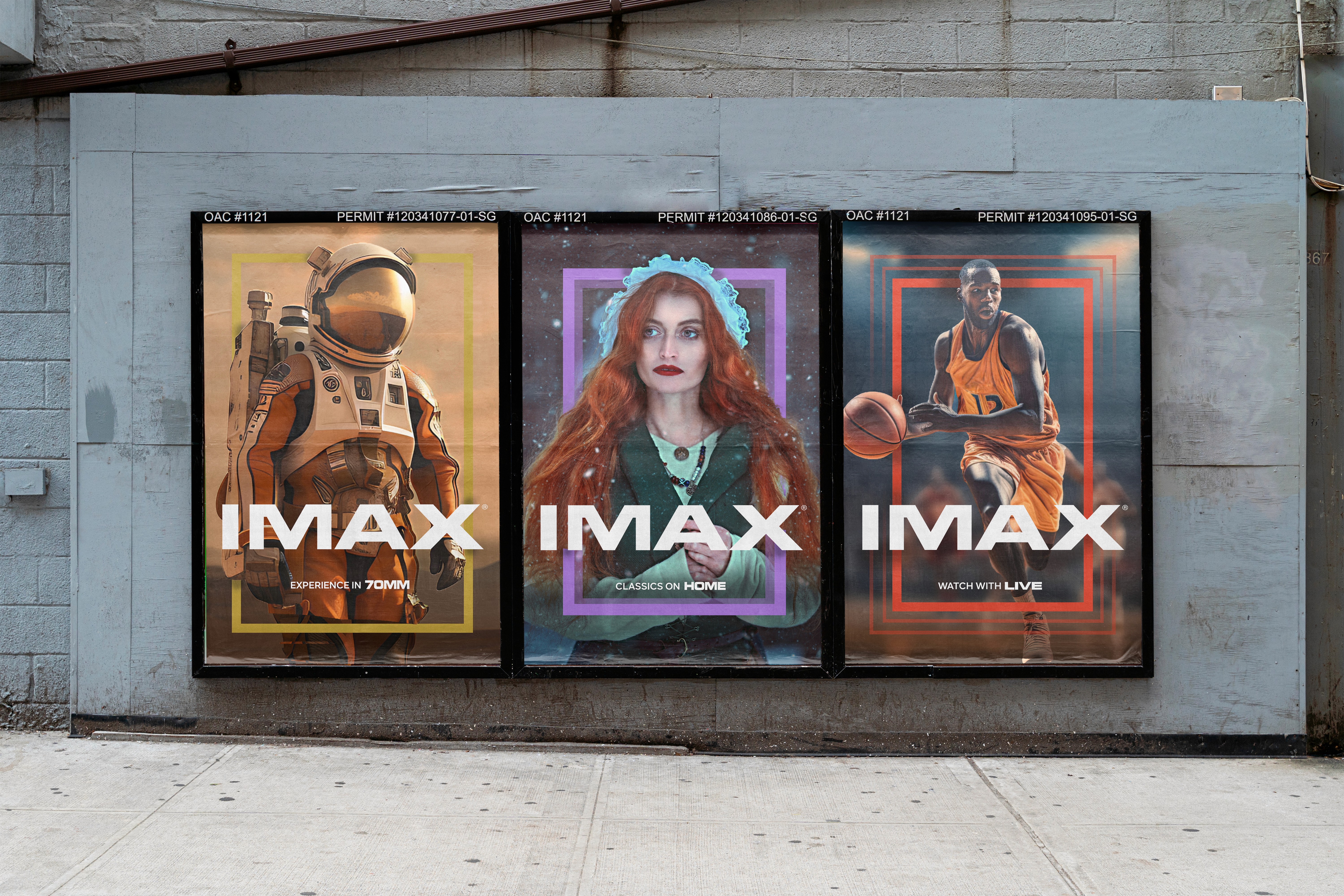
The visual expression for IMAX Bigger & Bolder uses four contrasting colours that evolve around the traditional blue, to represent the vast differences between the offerings. The colours echo to each products individuality and personality traits.
IMAX LIVE: Red represents the energy, excitement and unpredictability of live events.
IMAX DOCS: Green presents the beauty of our natural surroundings, hope and vitality of documentaries.
IMAX 70MM: Gold presents the elegance of the best film format in the world, prestige and richness of the large screen.
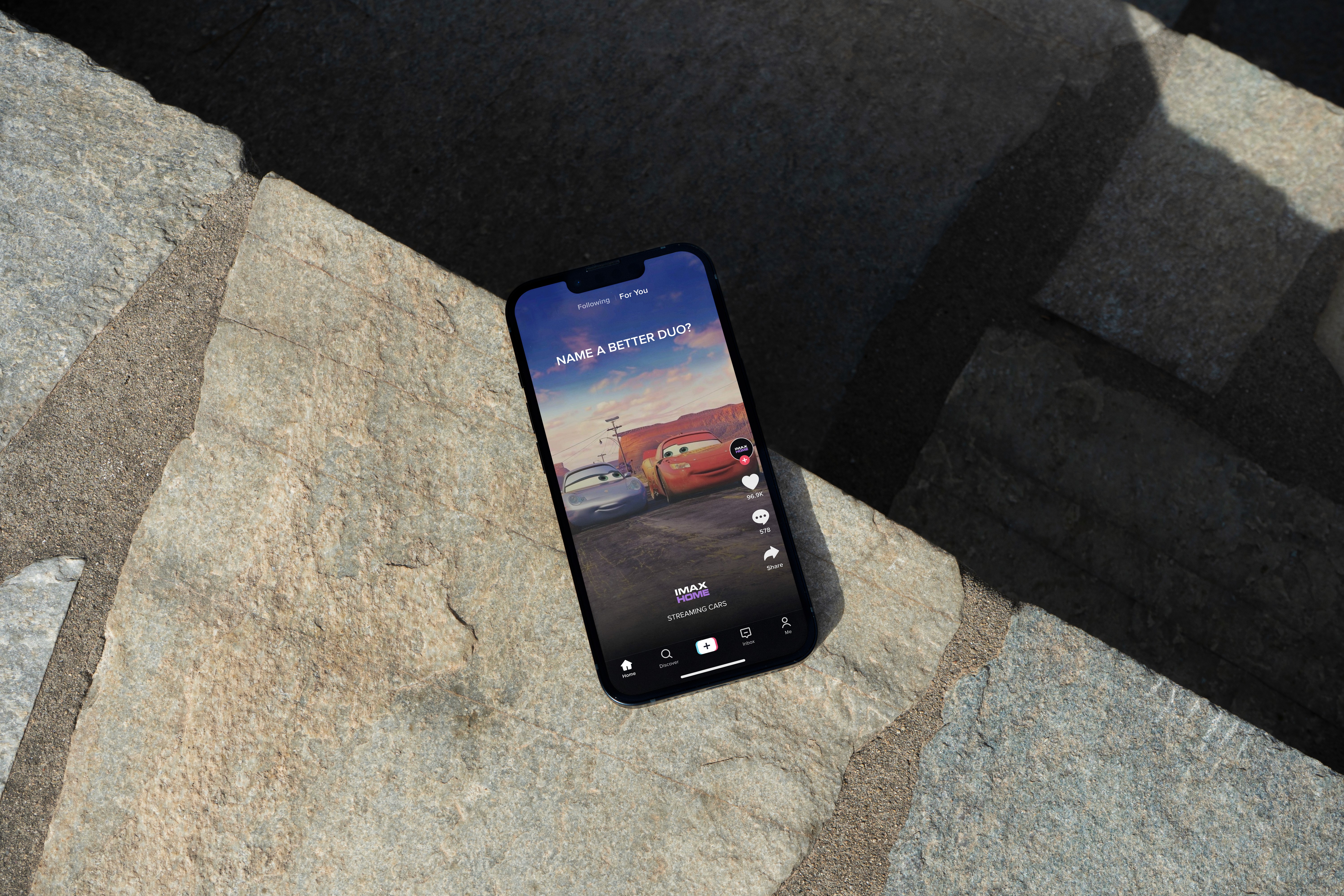
IMAX HOME: Presents the magic of movies at home, the ambition and power of streaming.
In the Family
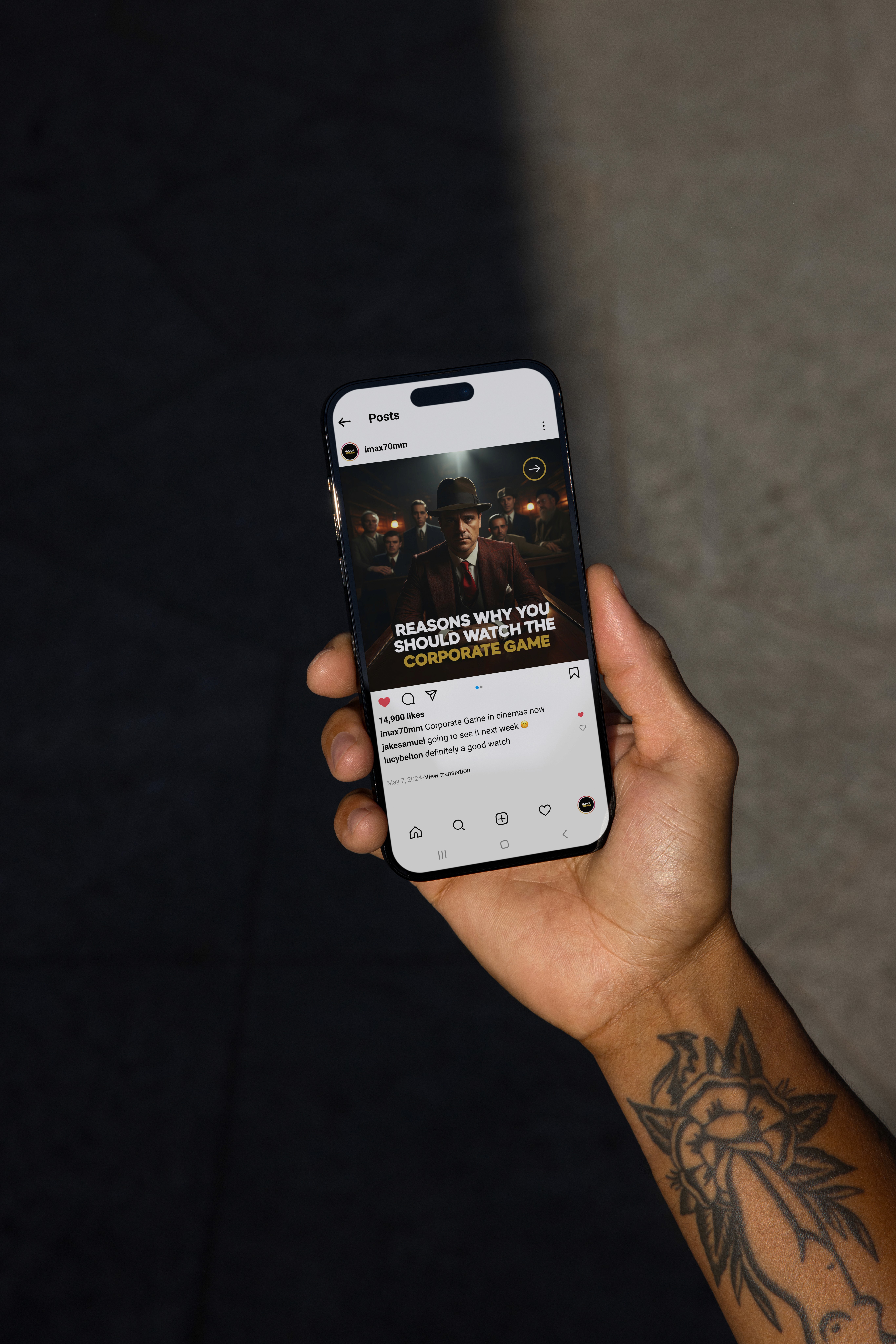
The concept takes inspiration from Film’s to the Fullest a great campaign from IMAX back in 2018 and looks to develop the concept by taking it further for example with the animation styles. As well as using the same typographic style that the brand already uses so the fit is seamless. The indents were produced using the iconic IMAX countdown to showcase the amazing content of each offering.
The Future
This identity is able to adapt in the future as the products themselves do. With colours being addable to the system. The same with animation and iconography associated with each offering can be different. This is IMAX.
Full Story
Going big has always been at the heart of IMAX. Now in its 57th year, the brand was first established to create a theatre experience with giant screens, surround sound, and stadium seating. Today, IMAX is the largest film format in the world, with years of technical development, countless stories and more than 1700 theatres globally. IMAX is now looking for a design system to be created that clearly distinguishes the new experiences and products. This was an exciting challenge for me to design for a brand I’ve admired for years.
What Was Done
With an array of content within the brand, the challenge was to develop a theme within the design system that expresses the spirit of IMAX’s partnership between them, their audience and people from around the world. To do this three key principles from the brand pyramid were identified these were...
We Are Bigger Than Big: Biggest screens, a more intense experience that immerses, transports and thrills with unique ‘wow moments’.
Dynamic: We are constantly show up in fresh ways.
For The Fans: Everything we do is fan-first…Because we are all fans, too, we embody, “if you know, you know.”
Taking into consideration Are we acting boldly, with confidence? These are the key points I aim to answer with this brief.
The approach was thorough and confident, born from a unique insight research showing that IMAX and its audience have two core ideologies that brings them together. They are big thinkers and are not afraid to make bold moves in any aspect of their lives.
This insight inspired a creative idea that expresses the theme of going Bigger & Bolder and reflects the scale of the offerings IMAX is presenting. Even when we thought they couldn’t get any bigger they have found a way. Creating a versatile identity that embodies future of new exciting possibilities for IMAX.
The visual expression for IMAX Bigger & Bolder uses four contrasting colours that evolve around the traditional blue, to represent the vast differences between the offerings. The colours echo to each products individuality and personality traits.
IMAX LIVE: Red represents the energy, excitement and unpredictability of live events.
IMAX DOCS: Green presents the beauty of our natural surroundings, hope and vitality of documentaries.
IMAX 70MM: Gold presents the elegance of the best film format in the world, prestige and richness of the large screen.
IMAX HOME: Presents the magic of movies at home, the ambition and power of streaming.
In the Family
The concept takes inspiration from Film’s to the Fullest a great campaign from IMAX back in 2018 and looks to develop the concept by taking it further for example with the animation styles. As well as using the same typographic style that the brand already uses so the fit is seamless. The indents were produced using the iconic IMAX countdown to showcase the amazing content of each offering.
The Future
This identity is able to adapt in the future as the products themselves do. With colours being addable to the system. The same with animation and iconography associated with each offering can be different. This is IMAX.


